CN logo evolution

More than half a century after it was designed, Allan Fleming’s CN monogram still looks like it could’ve been created today. Designers around the world often choose it amongst their favourite marks. Here are the lesser known logos that preceded it.
Much of the following information is courtesy of CN.
1852: Grand Trunk Railway
CN’s logo dates back to the birth of Canada’s first major railroad, the Grand Trunk Railway (GTR), a line that eventually joined others to form CN.
Built originally to link Montreal and Toronto in the 1850s, GTR saw its future as an international railroad serving markets on both sides of the Canada-U.S. border — a feat that it accomplished within a decade.

Grand Trunk Railway map, via Victorian Wars Forum
1883: Intercolonial Railway
Built during the 1870s, the Intercolonial Railway (ICR) was another railroad that eventually joined others as part of CN. It linked Nova Scotia and New Brunswick with Quebec.

Its logo proudly dubbed the line the “People’s Railway” and adopted the moose as its trademark due to its superiority in the animal kingdom and, in turn, its ability to hold its own against all rivals in its domain.
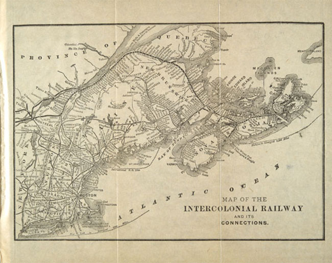
Intercolonial Railway map, via Library and Archives Canada
1896: Grand Trunk Railway System
Under new general manager Charles Melville Hays (a victim of the Titanic), the Grand Trunk Railway adopted a more aggressive management style — and a new logo to express the change.
Hays set about modernising and expanding the British-owned railroad, renaming it “Grand Trunk Railway System” to reflect its far-flung interests.
A version of the logo was the so-called “tilted wafer” — the company name on a square tilted nine degrees downward to the left, presumably an eye-catching device to convey motion. However, the logo’s simple lines didn’t please everyone. One observer thought it was “the most prosaic” of the major Canadian railroad logos.

Grand Trunk Railway System timetables 1898, via railroads.uni.edu
1899: Canadian Northern Railway
The Canadian Northern Railway resulted from the ambitions of two energetic, small-town-Ontario rail promoters, William Mackenzie and Donald Mann.
After acquiring a couple of small Manitoba lines in the mid-1890s, Mackenzie and Mann incorporated the Canadian Northern in 1899 and began expanding rapidly both east and west.

Canadian Northern reduced rates 1904, via Library and Archives Canada
By October 1918, Canadian Northern had fallen victim to its own ambitions and economic forces beyond its control. Beset by declining revenue, rising costs, and lack of capital during World War I, it teetered for a time on the brink of bankruptcy. The railway was taken over by the Canadian Government in August 1917 — only to become one of CN’s constituent lines in 1919.
The logo of Canadian Northern Railway would serve as a prototype for CN’s logo during the first few years of its existence. Essentially, CN took the easy way out and simply replaced the “Northern” in the Canadian Northern logo with the word “National.”
1905: Grand Trunk Pacific
At the turn of the century, Canada was riding high on an economic boom. Confined to eastern Canada, the Grand Trunk Railway under expansion-minded Charles Hays felt boxed in and longed for a piece of the action.
Meanwhile, the Government was convinced that Canada needed and could easily support at least one more transcontinental rail line. A second coast-to-coast railroad would also break Canadian Pacific’s monopoly in the west.

So Grand Trunk and the Government got together to construct a third east-west line. GTR incorporated a subsidiary, the Grand Trunk Pacific Railway (GTP), in 1903, which would run between Winnipeg and Prince Rupert. The Government, meanwhile, would build the eastern portion, known as the National Transcontinental Railway (NTR), from Winnipeg to Moncton.
Grand Trunk Pacific’s logo was derived from its parent’s logo, featuring the “tilted wafer.” It bore the words “The Only All-Canadian Transcontinental Route” — perhaps an act of one-upmanship over rival Canadian Pacific, which reached its eastern terminus via the state of Maine.

Grand Trunk Pacific farmland ad 1913, via Ben Bradley
A similar tilted wafer with the slogan “The Transcontinental Line” was also used to identify the GTP/NTR system. But like Canadian Northern, GTP came to grief during the economic turmoil of World War I. The Canadian Government nationalised the property in 1919.
1915: Canadian Government Railways
The term Canadian Government Railways (CGR) was a catch-all phrase used to describe a group of railroads owned by the government of Canada in the early part of the 20th century.
Each of the railroads making up CGR was managed independently. In 1915 the group included:
- The Intercolonial Railway (Government-owned since its inception in 1867)
- The National Transcontinental Railway (also Government-owned from its start in the early 1900s)
- The Prince Edward Island Railway (taken over soon after Prince Edward Island joined Confederation in 1873)
- The yet-to-be-completed Hudson Bay Railway (a Government-propelled project all along)
- To these ranks the Canadian Northern Railway was added in September 1917, shortly after a Government takeover

Canadian Government Railways had a simple logo, but apart from that unifying device, the line had a shadowy existence with very little real substance or organisation.
1919: Canadian National Railways
The name “Canadian National Railways” first appeared officially on December 20, 1918, when the Government authorised that term as a descriptive name for the various properties that made up Canadian Government Railways — principally, Canadian Northern, National Transcontinental and Intercolonial.
Six months later, on June 6, 1919, Parliament passed legislation to incorporate the Canadian National Railway Company Limited — and CN was born. The following year, the Grand Trunk Pacific was added to the line-up, giving the new railroad two transcontinental networks.

With so many component parts, each with its own strong identity, CN struggled to craft a single, recognisable face to show the world. During the first few years, it took the easy way out and used two different logos, each one mimicking the trademark of a predecessor railroad. Equipment and sign painters simply replaced the “Northern” in the Canadian Northern logo and the “Government” in the Canadian Government Railways logo with the word “National.” A practical and economical solution, perhaps, but it did little to foster a clear conception of the new railroad in the public’s mind.
The two logos CN used during this period were usually printed in black or white according to the desired contrast with the background.
1923: Canadian National Railways
The finishing touch to the creation of Canadian National Railways came early in 1923 when the Grand Trunk Railway joined the system after a Government takeover some three years earlier. That event quickly led to a unified corporate image for the new railroad, one it would display with few major alterations for 38 years.

CN abandoned the stop-gap solutions of its first few years and introduced a single design to represent the entire company. But like the two earlier versions, the new logo reflected CN’s parentage — this time, the Grand Trunk and its familiar “tilted wafer.”
At first, CN used a square-shaped wafer, just as GTR did. Then, in 1927, the square became a rectangle, presumably to accommodate longer yet fewer words.
The red used in the logo was CN No. 10, which is close to Pantone 200c. The lettering was gold on equipment, for which there is no good Pantone equivalent. In print, however, the yellow employed to represent gold was close to Pantone 115c.
1943: Canadian National Railways
During much of the first decade, President Sir Henry Thornton had led the company with great panache, expanding into fields as diverse as radio broadcasting, resort hotels and ocean liners. Then came the Crash of 1929. While business plummeted and hostile politicians clamoured for an end to the publicly owned system and its “extravagance,” CN stumbled through much of the Dirty Thirties.
But when World War II broke out in 1939, CN seized the opportunity to demonstrate its value to the nation. It performed prodigiously in the war effort, turning handsome profits as well.

The first significant change to CN’s logo came in 1943, 20 years after it had been adopted. In a sense, the modified logo symbolised the railroad truly coming into its own and hitting stride after two decades of struggling to define its role.
Buoyed by patriotism and a new sense of mission, CN superimposed the tilted wafer on a maple leaf, creating a new logo with built-in flexibility. First applied to a new batch of boxcars in 1943, the logo featured “CNR” above the wafer, while the slogan “Serves All Canada” replaced “Canadian National” on the wafer.
Variations on the theme would appear in later years — different colour schemes and alternate slogans, such as “Canada’s Largest Railway.” CN continued to use an unadorned wafer for some applications, but for the most part, the instantly recognisable maple leaf and the nearly ubiquitous slogan “Serves All Canada” became synonymous with Canadian National.
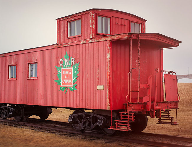
CNR emblem, via Gary DB
The maple leaf was Green No. 12, for which Pantone 363c is a good match. The rest of the logo usually appeared in white against whatever the background colour was: brown on boxcars (Pantone 174c) or orange on cabooses (Pantone 166c).
1954: Canadian National Railways
Emerging exhausted from the extreme demands of World War II, CN badly needed modernising and energising if it was to hold its own against growing car and truck competition. Donald Gordon, who became President in 1950, was just the man for the job.
Gordon transformed the railroad from the ground up, replacing steam with diesel power, introducing computer technology, restoring the worn-out freight car fleet, and recruiting and training a highly skilled management team.
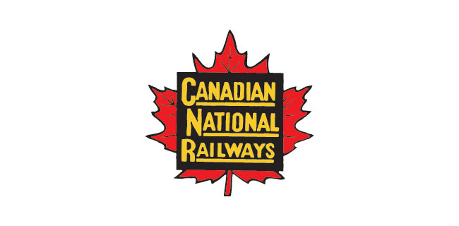
CN was changing rapidly — but the changes were happening largely beneath the surface, virtually invisible to the public eye. Yet CN initiated just one relatively minor modification to its corporate symbol during the 1950s, barely reflecting the immense progress underway.
In 1954, to mark the arrival of new passenger cars equipped with unprecedented amenities, CN eliminated the wafer’s tilt and redrew it as a straight square on the maple leaf. As changes go, it was hardly dramatic — but it did have the virtue of being easier to apply to CN’s mammoth locomotives and railcars.

Canadian National Railways locomotive, via Mike Robbins
The maple leaf was CN Red No. 10 (Pantone 200c), the wafer was black, and the lettering simulated gold (Pantone 115c).
1960: CN
The story begins in 1959 when a revitalised and confident CN surveyed Canadians’ attitudes to see how it measured up in the public mind. The findings came as a great shock: when people thought of CN, they pictured an “old-fashioned,” “backward” organisation, hostile to innovation — the very opposite of what the company was trying to achieve.
Dick Wright, head of public relations at the time, firmly believed that “seeing is believing.” If CN had a fresh new trademark, he reasoned, people would be more likely to think of it as the customer-friendly, technologically advanced railroad it was rapidly becoming. Wright commissioned New York designer James Valkus to study the problem. Valkus became convinced that what CN needed was not just a new trademark but a complete overhaul of its visual image — from locomotive paint schemes and building exteriors right down to the sugar packets used on passenger trains.
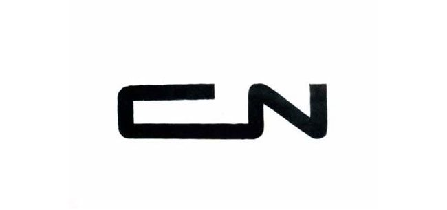
A new logo would be the heart of the redesign program. It had to be perfect from both an aesthetic and a practical point of view. It had to communicate the essence of the new CN: powerful, progressive, dynamic. Valkus assigned the challenge to Allan Fleming a young and highly regarded Canadian graphic designer. After experimenting with countless possibilities, Fleming hit on a particularly inspired design while sitting on a New York-bound airplane. He quickly sketched the idea on a cocktail napkin — and CN’s logo was conceived.

CN logo sketches via designKULTUR



Handwritten note from James Valkus
It was a dramatic contrast to the existing image. Out went the maple leaf, out went the time-worn wafer. Indeed, out went the “CNR.” Fleming had come up with a way of combining the “C” and the “N” in a harmonious, evocative manner. Abolishing the “R” made the logo bilingual (“Canadien national” as well as “Canadian National”). Without the “R” for “Railways”, the logo could be used as a unifying mark that would also serve the many non-rail businesses CN ran at the time — hotels, telecommunications and ferry services, to name a few.

Fleming avoided literal symbols — no animals or vegetables allowed — because they tend to show their age very quickly. As Fleming put it: “A literal drawing in 1944 of an object — even a plant leaf — looks in 1954 as if it was drawn in 1944. After five, 10 or 15 years, that symbol would have to be revised. In fact, CN itself has had that history up to now — of constantly revising its trademark bit by bit — and every time it has been revised the one before it is out of date, and it costs a lot of money and a lot of hard work to keep ahead of the game.”
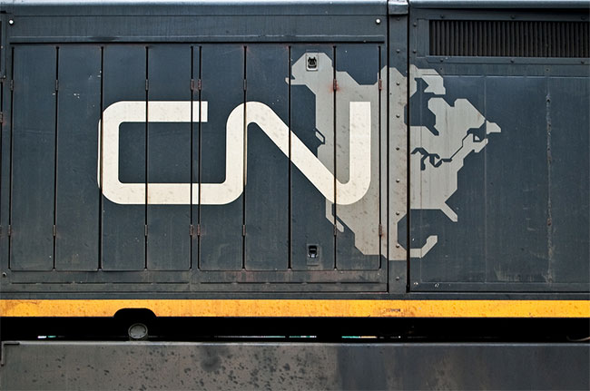
Photo via everkamp
While conceptualising the future, Fleming drew on the past for the kind of image that would convey timelessness. Studying the Christian cross and the Egyptian symbol for life, he borrowed the idea of using a line of single thickness. “The single thickness stroke is what makes the symbol live,” Fleming later said. “Anything else would lack the immediacy and vigor.”

Allan Robb Fleming, via
The continuous flowing line symbolised “the movement of people, materials, and messages from one point to another,” Fleming said. As the eye moves from “C” to “N,” the image suggests fluidity and motion. “It’s a route line that incidentally spells CN,” Fleming explained.
Photo by Tim Stevens
More about Fleming’s mark in the CN visual identity guidelines (PDF).
This post in its entirety was reproduced from http://www.logodesignlove.com
Euro railfanning

Just back from a very enjoyable two-week family vacation to England and France. One of the many highlights on the trip was taking the Eurostar from London to Paris. Besides the fact that I hadn’t taken a passenger train in ages, the experience of high speed train travel was exhilarating.
Barry, our train’s engineer, was kind enough to take the photo of me (above) and we started taking about railfanning. He had never heard of Rapido, so I introduced him to their UK website and he seemed genuinely impressed that a Canadian company was producing British train models.

We left London St Pancras International train station (built in 1868) and 2 hours and 16 minutes later arrived in Paris at the Gare du Nord. Free wifi, great food and fantastic scenery (Chunnel included) and some very different railfanning…. what could be better?

All of this made me wonder if the Europeans have got it right. When was the last time that any of us really considered passenger rail travel as a viable transportation option? It might be time to hop on VIA to see if the Canadian experience measures up to what I experienced in Europe. Perhaps I will be pleasantly surprised.

Done in a Day
 Like many modelers, I admire the work of Pelle K Søeborg, both because it is amazing in its detail and execution, but also because Pelle publishes his techniques and teaches me ways to be better.
One of the books that I own and take inspiration from is his Done in a Day book (pictured). More than a dozen easy weathering and detailing projects show you how to add realism to rolling stock and locomotives.
Serendipity on the GEXR
serendipity
Spent today at the Woodstock Model Train Show with Luc Sabourin and met his friend Nad Qureshi. I have a really great story about a very nicely weathered autorack that I bought from Nad… but that is a story for another day.
On the way back from the Show I had to detour off of the 401 due to a major accident. My mild displeasure (that my 90 minute drive home would take longer) turned to pleasure as I came upon this scene.


QGRY 2500 (a GP35 originally built in 1965 for the Southern Pacific) had been reassigned to the Goderich-Exeter Railway (GEXR). I had previously photographed QGRY 2500 in October 2013 in the Ste-Thérèse (Montreal) QGRY yard; and here she was again looking a little worse for wear but still working hard to earn her keep.
Today I spotted QGRY 2500 at Hunt Logistics in Cambridge, Ontario. 2500 was parked at the time but was about to pull (or had just pushed) three cars into the Hunt Logistics spur. The rest of the train was parked 400m to the south. [EDIT: According to the comments I received on this post, QGRY 2500 may not have been working as hard as I thought when I found her parked. Seems like this may be the spot that this engine is parked when not working. Thanks to all who commented.]

I love unexpected railfanning! It was especially nice to come upon a QGRY locomotive completely by accident…. and a perfect end to another great model railroad day.
Hay there!
Recently, I have come across a number of excellent ‘how to’ videos on YouTube.
The best and most exciting thus far has been Luc Towan’s Realistic Hay Bales video (below). I have been looking for a good hay bale for a while now, and these are the best I’ve ever seen. In addition, you can’t beat the price of homemade.
While I do enjoy the $$$$ savings that come with a DIY project, even better is the feeling of accomplishment that comes with a successful ‘build’.
I have tried Luc’s method and as you can see from the pic below, the results were very satisfying.

Wordless Wednesday
Toronto Railway Prototype Modelers Meet
“It was 4 feet too long and the ribs were a little off”, is not something that you’d ever hear me say, so I was a little wary when I decided to attend the 2016 Toronto Railway Prototype Modelers Meet at Humber College on Saturday.

Here was I, a beginner/intermediate (at best) modeler, going to an event that attracted the very best of the best prototype modelers, the guys who had been the the hobby for years and years perfecting their skills and honing their craft. Was I crazy?
A very big part of the day is the “bring and brag” component, where modelers display models and answer questions about their techniques. We were each encouraged to bring a model and I wondered if I was worthy – should I bring something?
I decided that I couldn’t very well show up without something in hand, so I’d give it a try. I brought three things; a Russell Snow Plow that I am trying to replicate from my CFL post, an HO scale headless horseman that my then 7 year old son asked me to build for him, and a scratchbuilt dumpster that I saw behind my son’s school. To my amazement my stuff was very well received!

The day also included three excellent clinics:
John Chipperfield discussed how he built the CPR West Toronto station and express building in HO scale. As I am planning on scratchbuilding most of my structures, I found his discussion of how he approached the build especially interesting.
Trevor Marshall extolled the virtues of S Scale and discussed the opportunities and challenges of modelling a specific prototype in 1:64 in his clinic entitled When I’m 1:64. He also talked about why he writes a blog about his layout http://themodelrailwayshow.com/cn1950s and why he considers it as essential to building a layout as having a good supply of ties and rail.
And finally, Sean Steele (pictured above) showed the use and effects of using commercially available chipping fluid to mimic severe paint flaking and damage in his talk: Chipping Fluid for Weathering. I am off today to get a cheap bottle of pump hairspray to give the technique a try. Thanks Sean!

In addition to all the great info and inspirational models, the best part of the day for me was meeting some really great (and talented) people. I was especially happy to bump into Chris van der Heide who has commented on this blog in the past and who blogs on his excellent Algoma Central in HO Scale. Chris has put together a fantastic step-by-step article on how to construct the custom flatcar lumber loads pictured above. In addition, Chris has made available over 60 printable templates on his blog for different lumber wraps. My goal is to make one of Chris’ lumber loads and bring it to next year’s meet.
It was also great to see ‘Muskoka’ Steve Juranics, Trevor Marshall, Steve Hoshel, and to meet Barry Silverthorn, the Executive Producer of trainmasters.tv. Which brings me to my last observation; it was incredibly inspiring to me that all of these fantastic craftsmen are so generous with their time and so willing to share their tips and techniques with other modelers. I felt like I came away with a ton of new ideas and ideas that I’d like to try.
A very excellent day with a great group of guys and a day that will now be on my list of not-to-be-missed model railroad events.
“This is the layout I’ve been dreaming about since I was 3 years old.”
Saturday was the 33rd Annual DOUBLEHEADERS Model Railroad self-guided home and club layout tour. This was the second year that I attended the tour that takes place in Cambridge, Kitchener, Waterloo and Guelph, Ontario and I managed to see seven of the over 30 layouts on the tour. Here are some of the highlights, along with my thoughts:

David Johns’ Ayr Junction Railway was my first stop of the tour. Besides being a fantastic layout depicting CPR operations in the mid 50-60s, in Southern Ontario and British Columbia, this layout features computer operated lighting. David has an Arduino controlling the lighting animation with 1 minute equalling 1 hour. In the 24 minute rotation we experience both day and night operations on the layout.
This really inspired me to thing seriously about lighting for my layout as it added such a wonderful dimension to the model RR experience.

David works for CP Rail as a Locomotive Engineer and is involved in cleaning up after derailments as was evidenced by the excellent scene above. It’s amazing how each layout is such a personal reflection of the owner and I enjoy all of the unique and personal touches that railroaders incorporate into making a scene. One of the great parts of this layout tour for me is was to see clever, new scenes that will act as inspiration for my modeling.

The nice thing about the Cambridge, Kitchener, Waterloo and Guelph, Ontario location of DOUBLEHEADERS was that you could stop for a bit of railfanning in between layout tours. Here is a nice little spur scene in Ayr, Ontario.
Kevin Miller’s Lehigh Valley New York Div. layout was my next stop. The amazing part of Kevin’s layout was the large collection of railroad collectables that he had in the train room. It never ceases to amaze me the many ways that people approach this hobby. I guess I have some bare walls to fill in my layout room.


The largest and most ambitious layout I have ever seen was Jim Moir’s Canada and New England Railroad. This unbelievable layout features three levels, each double decked with over 3000 feet of handlaid track and a 1600 foot main line. If my math is correct, Jim has modeled 26 miles of main line track!!!!!!!!!

Jim, a retired Civil Engineer told me, “This is the layout I’ve been dreaming about since I was 3 years old.” There is no way to do the layout justice with a photograph, so I tried to capture a bit of the scope and scale with the video (below).
Charlie Ellis’ mailbox (below) indicated that I was in the right spot. Not sure that I could get this bit of home decor past my Chief Decorator (wife).

Ended my day at Steve Juranics’ Muskoka Central. You may remember Steve from the Whether (or not) to weather post and his wonderful Maple Leaf Trading Co. project. Steve is one of the best prototype weatherers around and I was looking forward to see what was new with his layout.

Steve built a wonderful trackside pond scene complete with a couple of my HO scale 3D printer beavers that I gave him. The scene turned out beautifully and will in turn, inspire my beaver lodge efforts.


And finally…a track plan!

For the last 2 years I have been really struggling with my track plan.
As I am on a Mac, I never did find a CAD/layout design program that I liked and that had a complete track library. There was one that I played around with, but honestly I couldn’t get it to work properly (and I am trained as a graphic designer!). Maybe that was the problem as I am used to more sophisticated layout and design programs.
In any case, the lack of good design software meant that every idea in my head and then roughly sketched on paper had to be manually tried (and tested) with turnouts on the benchwork. What looked good ‘on paper’ never really fit together the way I intended and I never could get it all quite ‘right’.
After watching Bill Beranek, The Track Planner’s excellent Operations presentation (above) on the YouTube Model Builders channel, and visiting his website, I became very interested in the AnyRail track planning software . Also happily, I just bought my 10 year old son his first computer – a PC. I purchased a full version of AnyRail and started playing around. It was fun, easy and finally I was able to try out ideas and really see what would work!
The result is my track plan (downloadable PDF file). I am still soliciting feedback from friends in the hobby that know more than I do about operations; however, I feel very close to having a track plan that works.
I can recommend the AnyRail track planning software and there is a fully functional free trial. Any thoughts or comments on my track plan are greatly appreciated.
Copetown is this Sunday

Copetown Train Show
A Canadian Association of Railway Modellers (CARM) Event
Canada’s Best Kept Model Railway Secret
Sunday March 6, 2016
10:00 AM – 3:30 PM
Copetown and District Community Center
1950 Governor’s Road, Copetown, ON
Admission: $6 (under 12 free)
Layouts, Historical Societies, Scratchbuilding Supplies, Manufacturers, Craftsman Displays, Slide and Photo Collections, and much more for the serious modeller.
Raffle tickets available – $2 for one, $5 for three, $10 for seven.
Copetown is a 15 minute drive from Hamilton, Ontario.



Recent Comments